

Design Trends of 2023
It’s THAT time again… a brand new year means brand new design trends!
At the beginning of each year, we love to explore what colours, patterns and fonts will be in-vogue for the coming 12 months 🖍️🎨😎
And we are excited to share our findings with you!
In a nut-shell, 2023 is all about:
👉 bold, vibrant colours
👉 free-hand, organic patterns
👉 a strong sense of personal style and experimentation
We personally love these themes because of the emphasis on individuality and natural expression. Each and every one of us is unique, and we all have our own way of expressing ourselves. And this should be reflected in all of our branding - particularly our logos, labels and packaging!
Please remember - these trends are only suggestions. Design is a very subjective, personal thing. When it comes to choosing your colours, fonts and imagery, you should ALWAYS go with your intuition.
Check out our findings below!
COLOUR
One of our favourite and most reliable sources for all things colour is the Pantone Colour Institute. They are arguably the most universally-recognised colour-matching system and are considered to be the global authority for colour communication and vision. They are used by many industries, including printing, graphic design, paint and cosmetics.
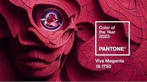
Pantone’s Colour of the Year for 2023 is Viva Magenta (18 1750) - and we absolutely love it!
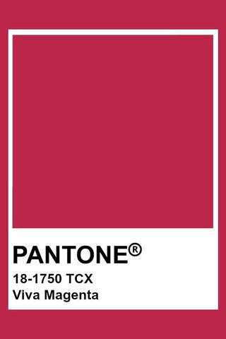
Here is the official description from the Pantone website: “(Viva Magenta) vibrates with vim and vigor. It is a shade rooted in nature descending from the red family and expressive of a new signal of strength. Viva Magenta is brave and fearless, and a pulsating color whose exuberance promotes a joyous and optimistic celebration, writing a new narrative.”
It sounds like a philosophy we should adopt in our own individual lives!
If Viva Magenta isn’t quite your vibe, other colours that are predicted as trendsetters this year are Pale Dogwood (13 1404), Fields of Rye (15 1115), Plein Air (13 4111) and Gray Lilac (13 3804).
PATTERNS
In a similar vein to the vibrant Viva Magenta, this year’s trendiest patterns are all about colour, organic expression and personality.
Retro Line Art
Do you remember making fun, cartoonish illustrations with felt-tip pens as kids? Well, retro line art is bringing this craze back! This is a minimal line art that is funny, free and light-hearted in style. What’s more, the simplistic style of retro line illustrations can handle bold and bright colours without overpowering other elements in the design or the viewers’ senses.
Retro line art can be used to create bubble fonts and simple, eye-catching imagery for your labels. Take a look at our awesome new, retro-inspired pre-made Mother’s Day labels
Folk Botanicals
With many of your products containing beautiful floral scents, botanical elements and natural ingredients, it makes sense for this pattern to make our list!
What we’ve found is that drawings of botanicals - flowers, leaves and other flora - are becoming less refined, and more whimsical. What does this mean? Think loose lines, shaky imperfections and free-hand doodles. In other words, more ‘hand-drawn’ and less ‘polished’. It gives designs a more lively, organic look which works wonderfully for natural, organic products. Check out our gorgeous Botanical Crystal vinyl label packs!
Abstract Gradients

We at Long Story Short love using colour in our creations! That includes ‘gradients’ - the gradual blending from one colour to another, allowing us to almost create a new colourway altogether!
We are delighted to see that the abstract use of gradients has made it into 2023’s hottest design trend. Think abstract shapes such as oblongs, curves or sweeping forms, and blurry diffusion of colours. The sky really is the limit!
Abstract gradient patterns can be used as backgrounds, logos or as supporting imagery for your labels.
FONTS
Once again, vibrancy and individuality are the key themes for 2023’s fashionable fonts!
Bright Red Font

Typically, the most popular fonts are presented as solid hues of black or white. Yet this year, bright red is the trailblazer in the typographic world. Considered one of the most intense colours on the spectrum, red also gives off a sense of importance, power and urgency. Yet when paired with this year's trendy patterns such as retro illustrations and thin, minimalist graphics, it has less of an overwhelming effect, and gives a much more light-hearted, joyous look.
Flexible Fonts

These are newly-developed typefaces that are experimental in look and feel. They tend to have unique spacing, stretched lettering or a more animated appearance (as opposed to traditional, classic fonts such as serifs or formal scripts). They may be trickier to source - they probably won’t be pre-loaded on your PCs or your design software! Yet many flexible fonts can be purchased or downloaded from sites such as whatfontis.com
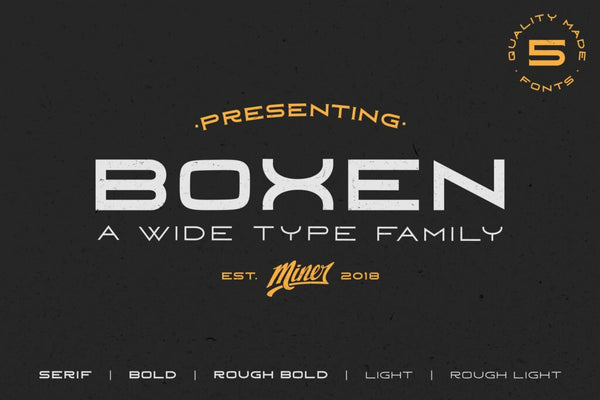
Some examples of flexible fonts are the sophisticated Golden Nature, the fun and friendly Nine to Five and the wide, bold Boxen.
We’d love to hear your thoughts! Which design trends are you excited about?